6 Articles
6 Articles

Instagram Head of Product Design Explains Thinking Behind That New Logo and Responds to Critics: ‘It’s Important for Us to Embrace the Future’
Instagram director of product design Jasmine Probst explained what went into the new logo and responded to critics who say it looks like 'Instagzam.'

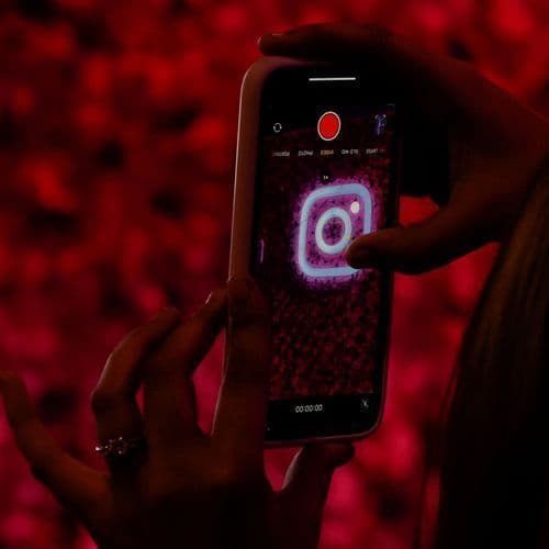
Mexico City.- Instagram has surprised its global users by implementing its most important visual renewal in a decade. Meta’s proprietary platform transformed its iconic written logo (wordmark, leaving behind the classic italic typography to give way to a cleaner and avant-garde design that fuses handwritten strokes with print letters. The camera’s characteristic multicolor icon remains unchanged.


After ten years, Instagram updates its logo with a modern look, and some users are not happy
Meta, the company that owns Facebook, Instagram, and WhatsApp, revealed a new logo last week. This is the first update for the content-sharing app in a decade. “The wordmark at the top of the app hasn’t changed in ten years, so it was time for a refresh,” Instagram head Adam Mosseri said in a post on the platform. “Cleaner and more modern, with references to the original and the simplicity and craft that’s always made it Instagram,” Mosseri said…


Instagram presented a new visual identity for its text mark, the logo composed only by the name of the company. The social media giant opted for the change, justifying that the previous version of its logo seemed outdated after ten years of continuous use. The change was communicated by Instagram leader Adam Mosseri, both [...]
Coverage Details
Bias Distribution
- 60% of the sources are Center


Factuality
To view factuality data please Upgrade to Premium